
La gestion du responsive dans une application React.js nécessite d’organiser le CSS, c’est important pour maintenir un code propre, lisible et facile à gérer. Voici quelques conseils de NetDevices pour organiser votre CSS dans le contexte de ReactJS, en mettant l’accent sur la gestion du responsive design.
1. Utiliser des pré processeurs CSS :
Utilisez des pré-processeurs CSS comme Sass ou Less. Ces outils permettent d’utiliser des fonctionnalités telles que les variables, les mixins et les nestings, cela facilite la gestion du CSS, en particulier pour le responsive design.
2. Diviseur en composants :
Pour une meilleure organisation et une isolation des styles, il est recommandé de diviser votre CSS en composants : Chaque composant React.js doit avoir son propre fichier CSS.
3. Requêtes multimédias :
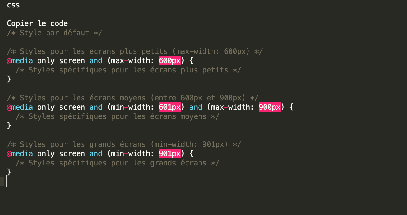
Utilisez des Media Queries pour appliquer des styles spécifiques à différentes tailles d’écran. Par exemple :
Vous pouvez utiliser Flexbox et Grid layout pour créer des mises en page flexibles et réactives sans avoir à gérer de nombreux points d’arrêt.
4. Le mobile d’abord :
Adoptez une approche “Mobile First” en définissant les styles de base pour les écrans mobiles, puis ajoutez des Media Queries pour des tailles d’écrans plus grandes au fur et à mesure que cela est nécessaire.
Pensez à utiliser des noms de classes significatifs pour rendre votre code plus compréhensible.
5. Gestion des thèmes :
Si votre application avait différents thèmes pour le responsive design, envisagez d’utiliser des classes de thème et de basculer dynamiquement entre elles en fonction des besoins de l’utilisateur ou du contexte.
Avec ces conseils, vous devriez être en mesure de maintenir un code CSS organisé et facile à gérer tout en prenant en charge le responsive design dans une application React.js.
Les Experts NetDevices vous accompagnent dans vos projets d’organisation, de gestion et de conception d’application.
Partager la publication "Comment organiser son CSS pour la gestion du responsive d’une application en reactjs ?"

