Infogreffe est un Groupement d’Intérêt Economique qui met à disposition du public les données collectées auprès des 134 greffes des Tribunaux de commerce.

About
Infogreffe est une plateforme qui centralise les informations du Registre du commerce et des sociétés (RCS) et regroupe tous les greffes des tribunaux de commerce français. Elle propose des informations juridiques et économiques sur les entreprises françaises et permet de réaliser en ligne les principales démarches administratives liées à la vie d’une société, telles que les modifications, les radiations et le dépôt d’actes.
Background
 Infogreffe a fait appel à NetDevices afin de rendre son site responsive sans passer par une application mobile. Pour ce faire, nous avons utilisé une de nos solution SaaS Web2Mobile qui permet avec du code rendre le site existant en version mobile.
Solution(s)
NetDevices à utilisé sa solution Web2Mobile et intervenu sur l’UX/UI : réalisation des interfaces et design, Photoshop, Justinmind, Media Queries (CSS), Javascript.
Impact
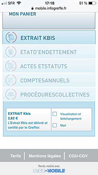
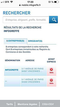 Grâce à l’intervention de NetDevices sur UI/UX pour la version mobile responsive, les utilisateurs peuvent accéder rapidement à toutes les informations légales d’une société française, incluant les statuts, les extraits Kbis, les comptes annuels, etc. Les informations disponibles sur Infogreffe proviennent de sources officielles. Pour les sociétés inscrites au RCS, les données sont extraites des registres publics de chaque greffe du Tribunal de commerce ou transmises par l’INPI pour d’autres juridictions. Pour les entreprises non-immatriculées au RCS, les informations proviennent du répertoire SIRENE tenu par l’INSEE. Pour utiliser les services l’utilisateur doit créer un compte sur le site et ajouter les informations requises selon sa situation.
Technologies


Challenges
Le défis pour NetDevices à rendre un site non responsive accessible sur mobile avec Web2Mobile, présente plusieurs défis majeurs. L’un des principaux défis consiste à adapter la mise en page et le design en utilisant uniquement les classes CSS existantes. Cela nécessite une refonte minutieuse du CSS pour garantir que les éléments s’ajustent correctement sur les petits écrans sans perturber la version desktop. Une solution efficace en réutilisant les classes CSS existantes et en ajoutant des media queries pour adapter le style aux différentes tailles d’écran. En parallèle, il est essentiel de tenir des réunions UX pour déterminer les écrans et les fonctionnalités les plus importants à conserver sur la version mobile. Cela implique de faire des choix stratégiques pour simplifier l’interface utilisateur mobile, en éliminant les informations non essentielles et en priorisant la clarté et la facilité d’utilisation. Grâce à cette approche, il est possible de transformer un site non responsive en une expérience mobile agréable et fonctionnelle, tout en optimisant les ressources disponibles.